In this story
- Before and after in thirty seconds
- Where it started: two pages that did not belong together
- The brief
- The fog took four tries
- Videos that open where you are
- A song that starts when you tap the sound wave
- Goodbye, Linktree: a learning hub in the same style
- How the work actually went
- What it cost
- What I did myself
- What I would tell you before you try
- Want one like this?
Lil Prompt is an AI singer with his own music, comedy sketches and short cinematic stories. Until this month he had a simple dark page of links. The man who creates him, Vitaliy, had a second page of links on Linktree: his courses, the AI tools he uses, a prompt pack and his own social accounts.
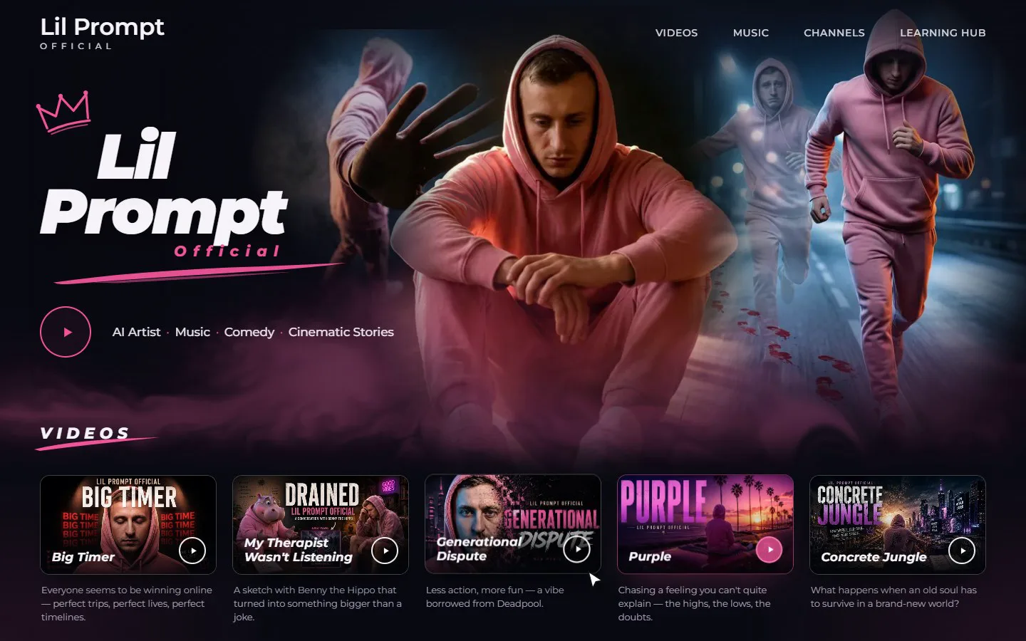
Two pages, two styles, and no clear line between the artist and the person behind him. Now there is one website in one style, with fog that drifts across the screen and gathers under your cursor, a song that starts when you tap a sound wave, videos that open right on the page, and a learning hub for anyone who wants to make videos like these.
I built it with an AI assistant. I am not a developer and I did not write the code. This is how it went, including the fog, which took four tries.
Before and after in thirty seconds
This short video shows the whole journey: the two old pages, the smoke I was choosing between, and what the site does now. It is vertical, so on a phone it fills the screen. If you would rather watch it on YouTube, the link is right under the player.

Where it started: two pages that did not belong together
On the left, the Linktree: Vitaliy's courses, tools and accounts in Linktree's standard black buttons. On the right, the old Lil Prompt page: a purple grid of channels and a spinning vinyl record. Each did its job. Together they looked like they belonged to two different people, and a fan who landed on one had no reason to find the other.
The brief
I sent the assistant the old site, three photographs of Lil Prompt and a background picture, and wrote down the rules in plain words:
- Every link that works on the old site must work on the new one
- No new links of its own
- Close to my mock-up, but not a pixel copy
- Think like the designer of a website for a popular AI artist, not like someone filling in a template
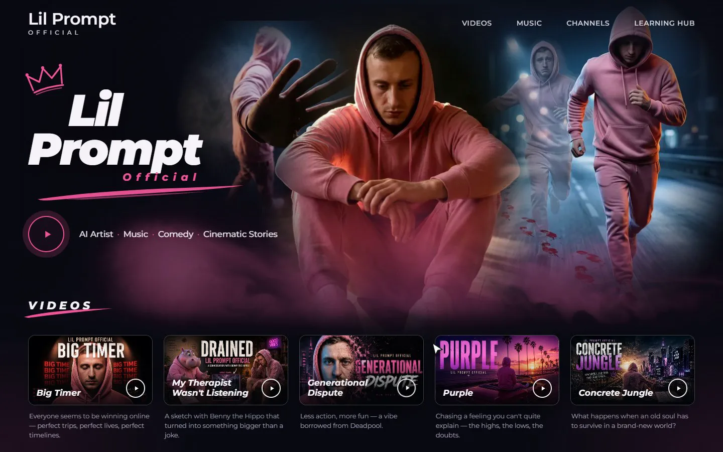
The first draft was ready in about half an hour: a dark hero with a collage of the three photographs, the logo with a pink crown, five videos, streaming buttons and channels, all checked on a computer, a tablet and a phone. Nothing was published yet. I only looked at screenshots and said what I wanted changed.
The fog took four tries
The mock-up had pink smoke in the corners, and I wanted it to feel alive: calm when nobody touches it, swirling when the cursor or a finger moves through it. This is the part of the project I am proudest of, because it was not right the first, second or third time.
Attempt one: a picture pretending to be smoke
The first version was a still image of smoke with a filter that bent it when you moved the mouse. It technically moved. It also looked exactly like what it was. My verdict, word for word: "It looks very artificial and not professional."
Attempt two: broken
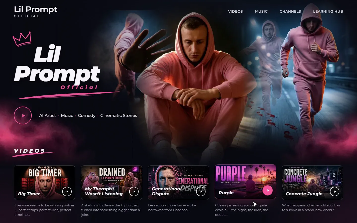
Next came fog drawn by the graphics card, several soft layers drifting at different speeds. On my screen it had hard, stepped edges, like a badly compressed photo. I wrote: "The smoke is broken. Very bad." I also sent a link to a site whose smoke I liked as a reference.
The assistant could not open that site, because this computer did not trust its security certificate, and it does not work around checks like that. So it searched for how effects like this are usually made, and found the cause of the steps: one formula had its limits the wrong way round. Some graphics cards forgive that, mine did not.
Attempt three: real, but far too thick
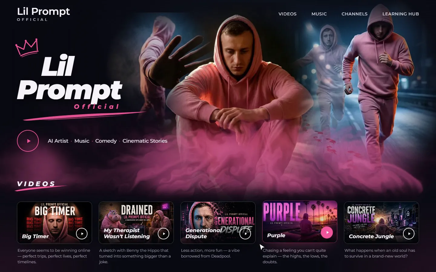
The third version was rebuilt from scratch as a real fluid simulation, the technique behind most good smoke effects on the web. The approach comes from Pavel Dobryakov's open-source WebGL Fluid Simulation, published under the MIT licence, which lets anyone use and adapt it, even commercially, as long as the author is credited. The assistant wrote its own version of the technique and credited him in the code. Now the smoke curled and folded like real smoke. It was also so dense that it covered the photographs.
Attempt four: my numbers
This time I stopped describing feelings and gave numbers:
Make it half as transparent and lighter at rest. Half the speed. A wider spread. When touched, a third thicker and faster, and the radius shrinks by a third, as if the smoke flies towards the point you touch.
The assistant mapped each number to a setting and explained which did what. The last wish was the interesting one: a normal fluid simulation cannot pull smoke into a point, so it added a separate step that draws the fog towards the cursor or finger. That is the version I approved, and it went live about thirty seconds later.
Videos that open where you are
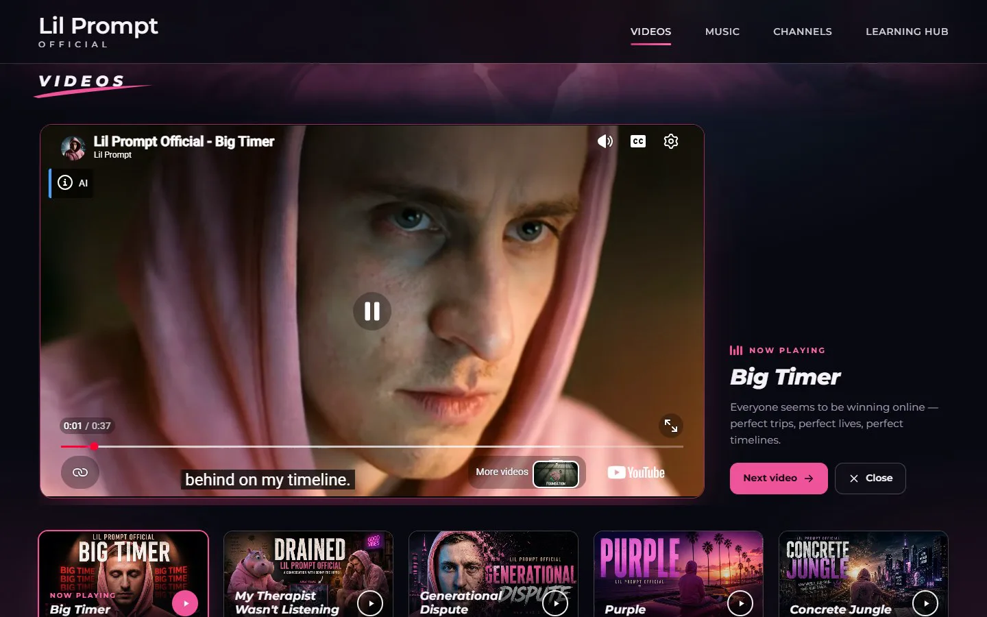
On a computer, pressing a cover opens a large player above the row of videos, with the title, a description, Next video and Close. On a phone the video plays right inside its card, because the cards there are nearly the width of the screen anyway. The YouTube player only loads when someone actually presses play, so the page stays fast.
A song that starts when you tap the sound wave
The Music section always had two animated sound waves next to the Spotify, Apple Music and YouTube Music buttons. Generational Dispute is one of Lil Prompt's most popular tracks and one of my favourites, so I asked for the wave to actually play it.
I handed over the studio file, 31 MB. It became a 4 MB MP3 that sounds the same and only downloads after the first tap. Tap the wave and the song plays, tap again and it pauses. While it plays, the bars move with the real sound, bass in the middle and high notes at the edges, and starting a video pauses the song so the two never play over each other.

If you have a music channel of your own, this is the part to copy: your releases, your streaming links and one song people can hear without leaving the page.
Goodbye, Linktree: a learning hub in the same style
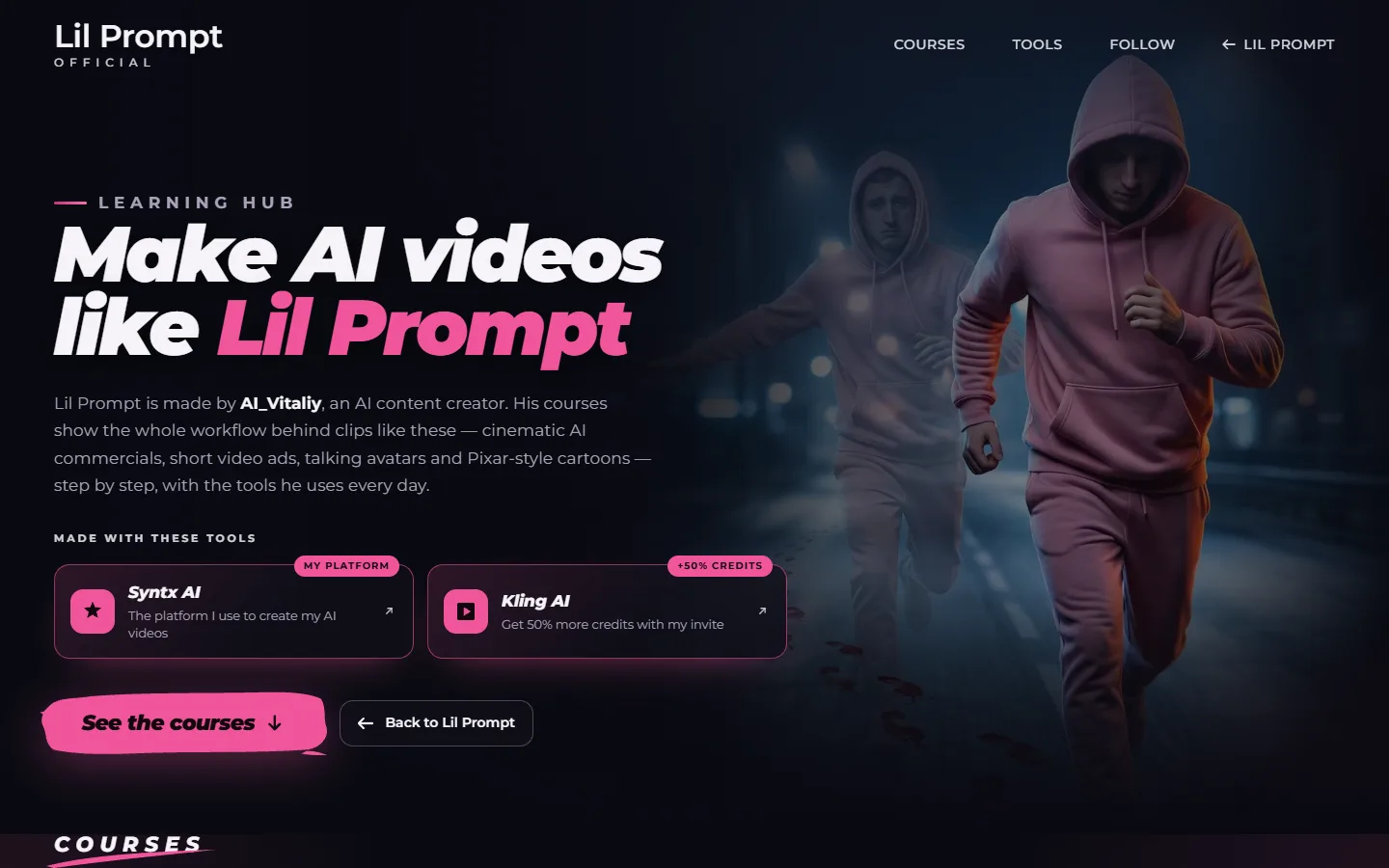
Next to the official links there was a big pink Start here button that simply sent people to Vitaliy's Linktree, without a word about what was there. So we replaced the Linktree with a page of our own: the Learning Hub.
It starts by saying plainly that Lil Prompt is made by Vitaliy and that his courses show how videos like these are made. Right under that, on the first screen, come the two tools he makes them with, Syntx and Kling AI, with his referral links. That is one more thing a site like this is good for: a stylish home for your own referral links. Then the courses with their real covers, the newest one marked as new, then a prompt pack and his social accounts.
On the main page the Start here button now explains itself: tools, courses and prompts from the creator behind Lil Prompt. The official part of the site stays clean, and nobody lands on a list of buttons from another service any more.
How the work actually went
Every change, small or large, followed the same rhythm:
- I describe what I want, often by voice
- The assistant asks a few questions first instead of guessing
- It builds a draft away from the live site and sends screenshots for a computer and a phone
- I answer with what I like and what I do not, as precisely as I can
- Nothing goes live until I write one word: approve
- Then it publishes, and about thirty seconds later the site is updated
The site lives on GitHub and Cloudflare Pages, which publishes every change automatically. Even the thirty-second video at the top of this article was made by the assistant: it recorded the real site in a browser, the cursor, the fog, the song and the videos, and animated the captions and transitions around those recordings.
What it cost
- Hosting on Cloudflare Pages: free
- GitHub, where the code is kept: free
- The address, lilprompt-demo.pages.dev: free
- My Claude subscription, which I was already paying for
No monthly fee for a link service, and no template that decides what the page is allowed to look like.
What I did myself
- Wrote the brief and the rules about the links
- Chose the photographs and the look
- Judged every version, including three versions of the fog I rejected
- Turned vague dissatisfaction into exact numbers
- Decided that the referral tools belong on the first screen
- Brought the song and approved every change before it went live
None of that is programming. All of it is taste and decisions, and the assistant did not make any of them for me.
What I would tell you before you try
Say why something is wrong, not just that it is. "It looks artificial" got a completely new approach. "Make it better" would have got the same thing again, slightly different.
Numbers beat adjectives. "Half as transparent, a third faster" fixed in one round what three rounds of description had not.
Look at screenshots on a phone too. Half of the decisions here were about how something feels under a finger, not under a mouse.
Want one like this?
If you have a music channel, a course, or a link page that has outgrown itself, this is what it can turn into. You can see the finished site below, and my other sites are collected on one page together with my contacts.